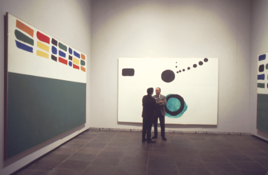
Adolph Gottlieb at the Whitney Museum with Stewart Kranz, 1968
Shown: Units #2, Azimuth, Units #3
Photo by Michael Fredericks
Art ©Adolph and Esther Gottlieb Foundation/Licensed by ARS, NY, NY
Those who are familiar with Adolph Gottlieb's work would probably recognize the terms "Burst" or "Pictographs" as familiar labels applied to his paintings of different periods. However, one label that might not sound as familiar is "Units".
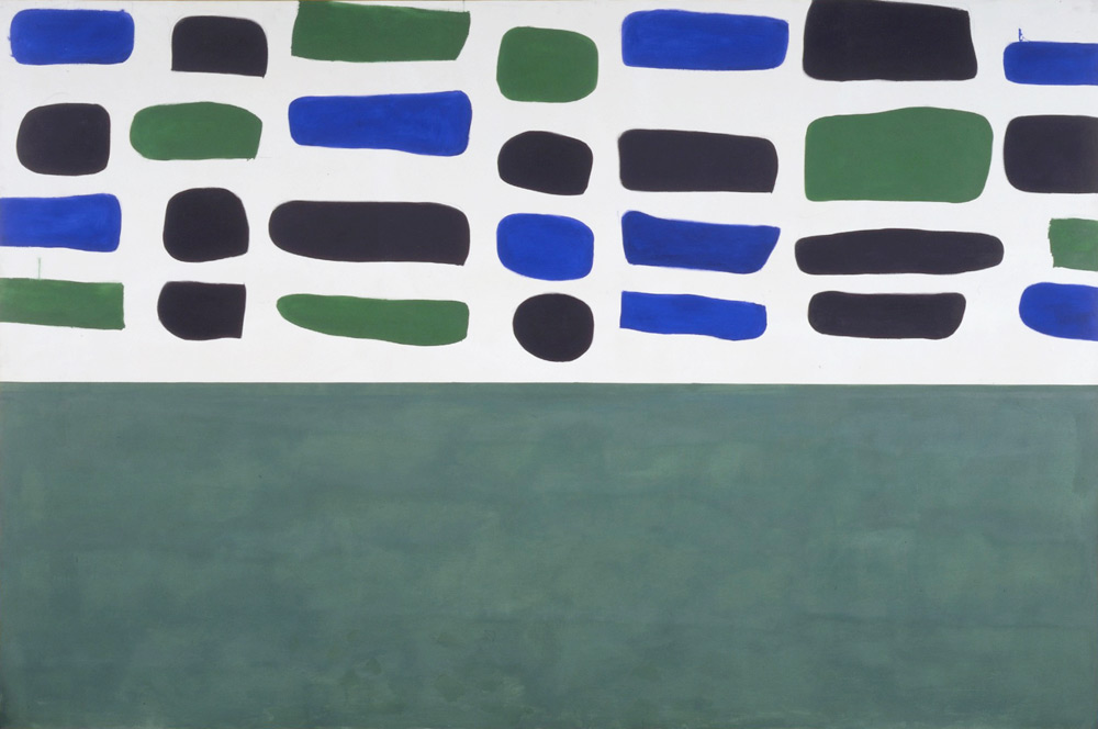
Shown: UNITS #3, 1965, oil on canvas, 96 x 144 “
Gottlieb’s Units image is characterized by its horizontal orientation and a division into two horizontal parts. The lower half is usually a field of dense color, while the upper half presents an array of shapes of varying colors. Gottlieb used this image to create five very large paintings (8 x 12 feet or larger) and several works on paper.
UNTITLED, 1970, acrylic on paper, 9 x 12 “
UNTITLED, 1970, acrylic on paper, 9 x 12 “
In his review of Gottlieb’s 1968 exhibition at both the Guggenheim and Whitney museums, critic Harold Rosenberg singled out the Units paintings saying, "Gottlieb today works on the edge of pure abstraction; to slip entirely into this current he has only to purge his paintings of symbolic mystery by asserting the physical mystery of color and shape…”Units II”, “Units III”, “Focal”, and “Sign” arrest the mind in the blankness of sheer looking…In general, however, Gottlieb has refused to restrain his painting from visionary probings. Signmaking is too deeply grounded in the psychological and cultural imperatives of his art to be renounced in favor of formal exercises.“
UNITS #2, 1965, oil on canvas, 96 x 144 “
To see more works by Adolph Gottlieb, click here
Adolph Gottlieb in his Bowery studio, 1968 (Units #4 on the right).
Also shown: Gray Ground (rear) and Red Ground Maroon Disc (left, in frame)
Photo by Michael Fredericks
Art ©Adolph and Esther Gottlieb Foundation/Licensed by ARS, NY, NY


